PRACTICAL 3
Practical 3
AIM :
Introduction to Orange Tool
THEORY:
Introduction to Orange Tool:
- Developed by Bioinformatics Lab at University of Ljubljana, Slovenia, in collaboration with open source community.
- Provides data visualization and data analysis for novice and expert, through interactive workflows.
- Large widget toolbox and several add-ons
- Open source project (GPL license)
Can be download from here.
Pros and Cons:
Comparison:
Importing tabular data:
1. Start Orange.
2. Add file widget into the canvas by clicking on the 'file' icon.
3. Select data source file.
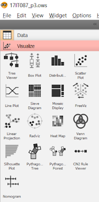
4. Add different data visualization widgets.
5. Connect file widget with other visualization widgets
6. Visualize the output by clicking widget.
Distributions
Box plot
Scatter Plot
Line Plot
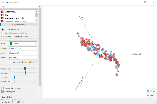
Linear Projection
QUESTION/ANSWERS
1. Is this tool easy to use compared to its peers?
Yes
2. Are there any other tools are available which provides more feature than this tool?
Yes, there are other tools available which provide more features than Orange tool
3. List some other open-source tool for data analytics
Knime, Hadoop, Spark, Neo4J
REFERENCES


Comments
Post a Comment