PRACTICAL 7
Practical 7
AIM:
Consume data with Power BI and How to build a simple dashboard.
Dataset Description:
This database contains 76 attributes, but all published experiments refer to using a subset of 14 of them.
Attribute Information:
- age
- sex
- chest pain type (4 values)
- resting blood pressure
- serum cholestoral in mg/dl
- fasting blood sugar > 120 mg/dl
- resting electrocardiographic results (values 0,1,2)
- maximum heart rate achieved
- exercise induced angina
- oldpeak = ST depression induced by exercise relative to rest
- the slope of the peak exercise ST segment
- number of major vessels (0-3) colored by flourosopy
- thal: 3 = normal; 6 = fixed defect; 7 = reversable defect
Steps to create Power BI Dashboard:
- Go to 'Get data' and to add your 'CSV' data file to load the dataset.
- Select your dataset (here in my case it is about heart Disease) and load it.
- You'll find the attributes of the dataset you've loaded on the right side and further you can find different types of visualization just before the 'Fields' column to add up various different visualizations to your dashboard.
Adding Different Visualizations:
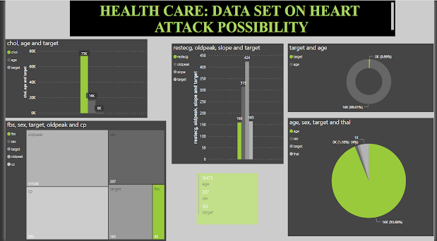
- Line and clustered column chart between cholesterol, age and target
- Clustered Column chart between resting electrocardiographic results, oldpeak, the slope of the peak exercise ST segment and target
- Donut chart between target and age, which in turn helps us to figure out how much the factor 'age' affects a person to get prone to a heart disease.
- Tree map between sex, target, oldpeak, fasting blood sugar and chest pain
- Multi-row card to find the count between age, sex and target.
- Scatter chart to find the factors affecting the most, which can be classified by the area covered by a particular attribute. The factors here contains age, sex, target value and thal.
- Later, you can get your dashboard ready and can publish it.
- This is how my dashboard looks like:
- Later you can open the Power BI online by going on to link and pin all the visualization of your workpace to your dashboard.(Note: requires your account in Power BI)
- Click on the 'new dashboard' option to add the it to your dashboard and Here, I named my dashboard as 'Heart_disease_analysis'.
- This is how our dashboard will look then and later you can add anything further according to your requirements.
- On the left hand side of the menu, you can find the dashboard being added to your workspace.


Comments
Post a Comment